Illustrations for Shopware
Back in 2020 we took a closer took into our Shopware administration empty states, and decided to fill the blank space with illustrations. I created an illustration style guide, and, based on that, some illustrations that fit the topic of each empty state in shopware.
You can find a screenshot of the implemented illustration on my dribbble profile.
Job Concept, documentation and design
Client Product design - shopware AG
Market B2C / B2C
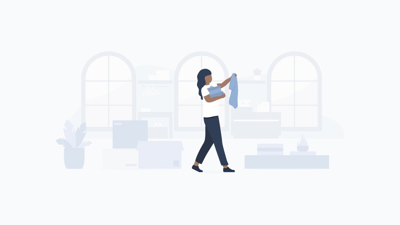



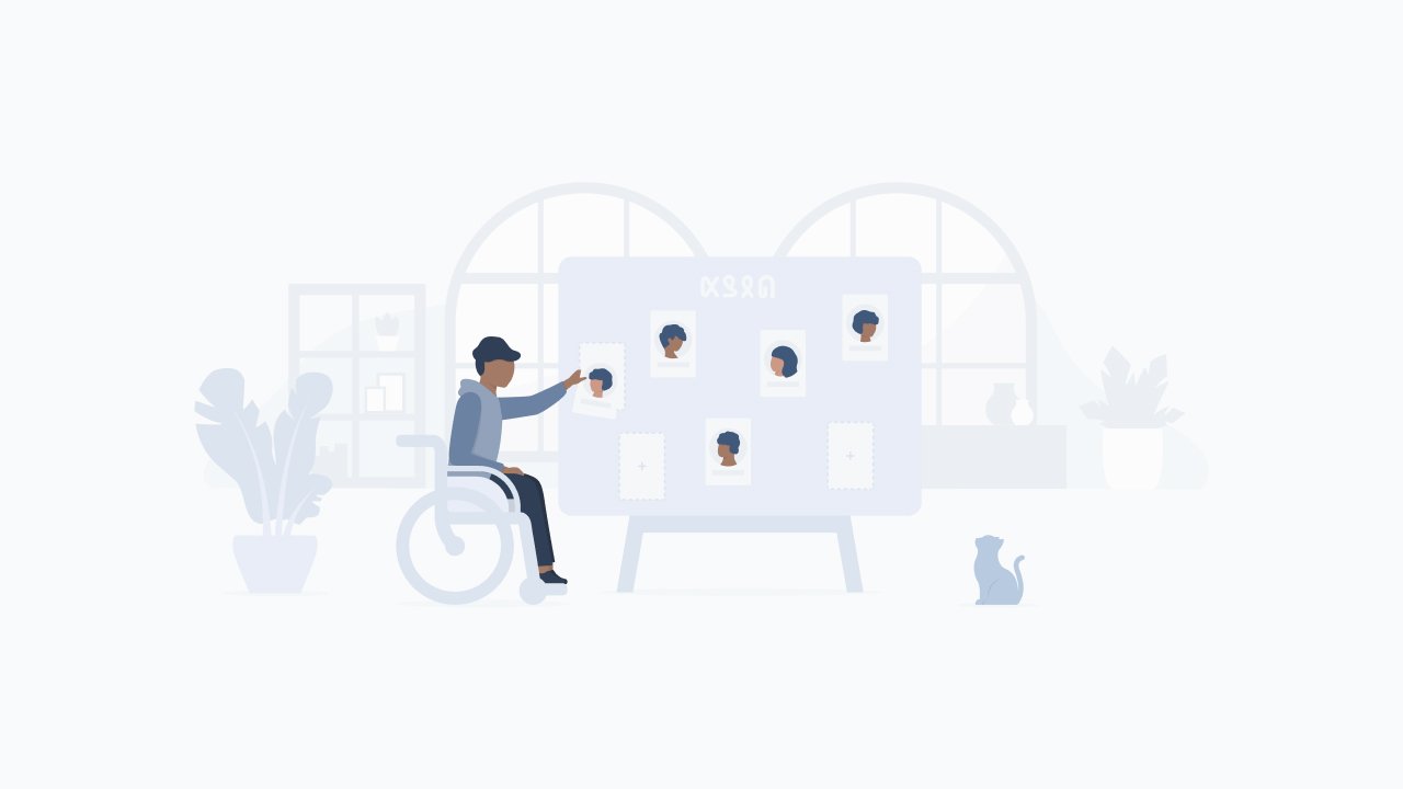
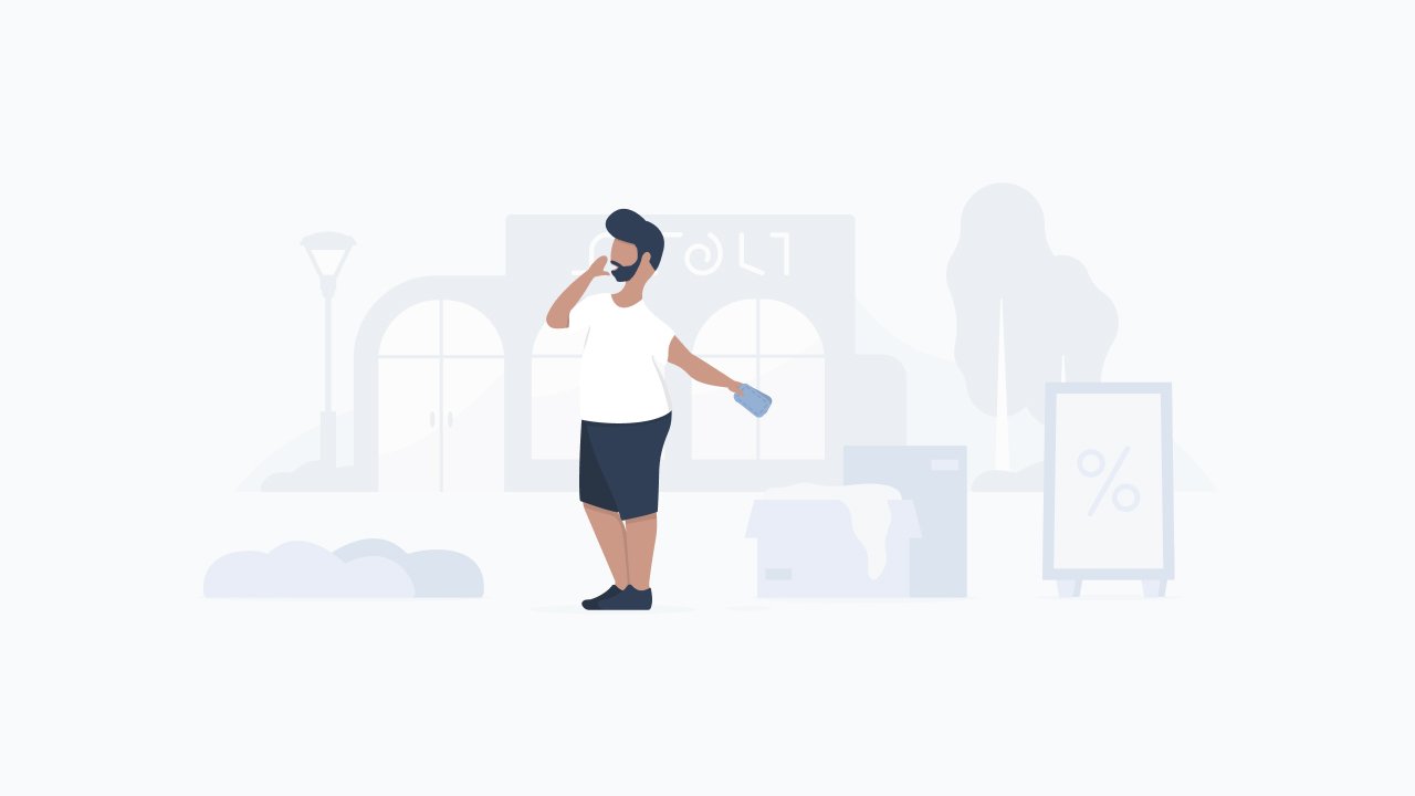
Every large empty state consist of a background, a foreground and a person which stands a bit in front.
Background
The background objects almost merge with the background color of the shopware admin. The background waves use the weakest colors and help with perspective. Illustrations can be in a room as well as outside.
Lower layer: The lower layer of the background is a cutted blob. It represents the walls, or the sky, and lays behind all other objects. On this blob are objects. Windows give rooms more light and make them appear friendlier and more open.
Upper level: Above the blob and the windows there are objects that represent the surroundings, such as a counter in a shop. At the same time the blob can also be displayed as a wall in the background. The objects are flush with the lower level and form the complete background with the lower level.
Foreground
The foreground has stronger colors than the background in order to stand out better. The elements are closely aligned to the humans.
Under each element (touching the 'ground') is an ellipse representing a shadow.
Human(s)
The person(s) are the center of the illustration. The bold colors are an eye catcher and lead the eye directly to the human.
If the person is not behind any object, they are not on the line of the foreground, but a bit in front of it.
Objects that are held / used / handled by people get the color HU4 (see Colors section).
Structure of an illustration
These special objects appear more frequently in illustrations and may lead to questions at first glance. To answer these questions and create clarity, they are described in detail here.
Wheelchair
People in illustrations that sit in a wheelchair should never look ill. The wheelchair represents a part of the person and adapts to the person, not vice versa.
There are never wheel spokes in the wheelchair wheel, it makes the wheelchair look dynamic and modern.
The armrest is divided into two parts so you can see more of the person him- or herself.
Swaggy the Cat
Swaggy does not necessarily have to appear in an illustration. He supports people in their actions, directs the viewer with his gaze to what is happening or brings a portion of extra relaxation into the illustrations.
Why a cat? Swaggy is shopware’s campus cat and also brings some relaxation into our everyday life. So why not also in our illustrations?
Plants
Plants should appear in any illustration. They are the organic counterpart to the rigid shelves, tables and co.
They fill white gaps and lead whether in the background or in the foreground for variety between books and products.
Letters/Text
Fonts, such as on posters and blackboards, are displayed in cryptic fantasy letters.
The letters are filled in order to be optimally integrated into the environment of the illustrations.
In no way do they resemble the Latin alphabet, or any other well known alphabet. If some letters should remind of more well-known letters, then these are combined with each other in such a way that no word is recognizable.
Decoration
Decorative objects such as vases, picture frames, but also other signs, are a must in illustrations.
They lend the illustration a personality and underline the place in which the current illustration is located.
Decoration objects can be placed in the background as well as in the foreground. They can appear organic, but also rigid.
Special objects
The color palette in the empty state illustrations is divided into background, foreground and human. Each set has its own color set to add depth to the illustration. None of the colors are used twice.
Almost all colors have a blue tint, which was derived from the shopware administration. The foreground and background palettes differ only slightly from each other, they adapt to the background color of the administration and almost blend into it. The human color palette is stronger, because they and their executed actions should stand out.
Background
Foreground
Human
The skin colors are divided into 4 color gradations and are used among equal parts. In each illustration with several people, several skin colors are represented. The default color is HU 1.2.


